GR 106 Calligraphy
Slide Show 3
-
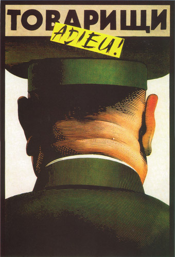
 Istvan Orosz - Comrades, It's Over
Hungary, 1989
The quick brushwork of "adieu" captures the moment of a country's release from domination and illustrates what would have been a paste-over to update an existing poster.
This work was created by a designer/illustrator who grew up in, and spent his life in, Soviet-dominated Hungary. He was surprised and delighted in 1989 when he drew this poster and soon afterward, the Soviet Army returned home.
-
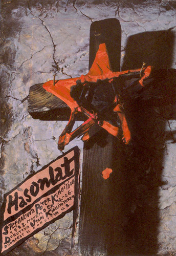
 Péter Pocs - Simile
Hungary, 1989
Bold informal brush script imparts a sense of personal immediacy and grass roots directness.
This poster, created for an exhibition of graphic designer Peter Stefanovits's work, was shown on Hungarian prime-time news. The news censored the controversial image of the communist star attached to the cross and showed only the text at the bottom.
-
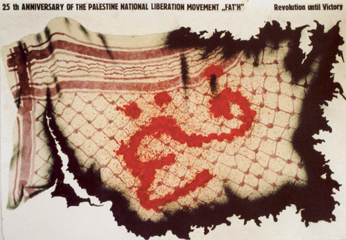
 Unknown Artist - Revolution
Poland, 1989
Calligraphic red paint and splatter technique is used to write the word Fateh.
The war-torn Kaffiyah has the word Fateh in Arabic "blood" red lettering. The Kaffiyah was turned into a symbol of the Palestinian state by Yassir Arafat and also became a symbol of the Fedayeen (Palestinian Freedom Fighters).
-
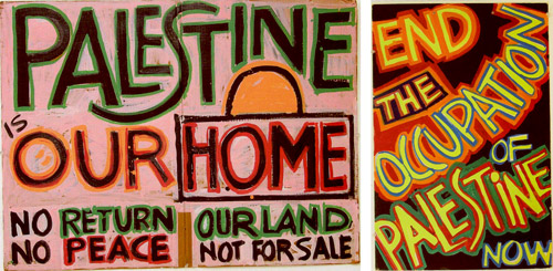
 Samia A. Halaby - Palestine Is Our Home / End the Occupation of Palestine Now
USA, 1991
Naïve block letterforms are used to simulate street protest posters.
The black background and bright colors in Palestine Is Our Home and End the Occupation of Palestine Now are a deliberate homage to Palestine Liberation art of the 1970s and 1980s and appeal to the visual requirements of the news photographers. These posters were used in Washington, D.C. as protest against the first Gulf War in 1991.
-
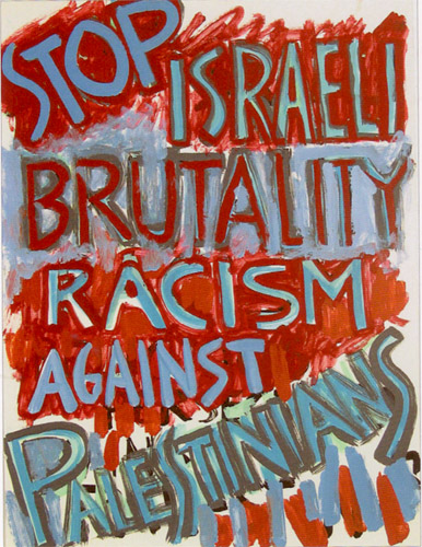
 Samia A. Halaby - Stop Israeli Brutality Racism Against Palestinians
USA, 1991
Naïve block letterforms are used to simulate street protest posters.
Stop Israeli Brutality Racism Against Palestinians was created to hang in the artist's home to identify her political and ethnic background to visitors. The artist noted that she "did not want to waste time with those who hated my national background...".
-
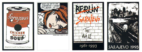
 Trio Sarajevo - Sarajevo Postcard collection
Bosnia and Herzegovina, 1993
Commercial script, graphic novel hand lettered majuscules, and brush lettering are useful in turning familiar icons into social and political commentary.
To convey the idea of suffering in Sarajevo, artists used any available images including pop and visual icons.
-
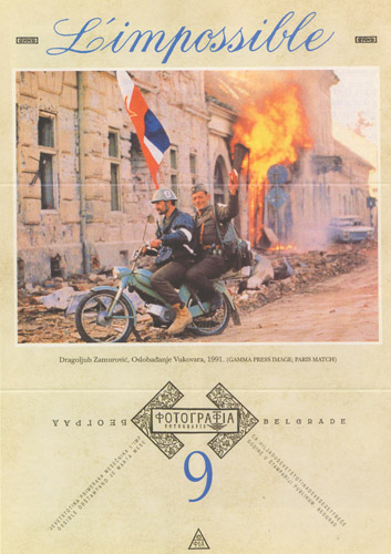
 Stanislav Sharp - L'impossible
Serbia and Montenegro, 1993
Handwritten Coppoerplate in elegant blue provides a strong sense of irony.
This flyer, which was distributed in Serbia, featured an image of Serbian soldiers riding through the ruined, a.k.a. "liberated," streets of Vukovar, proving that soldiers from Serbia took part in the war in Croatia, a fact that was not acknowledged by the Serbian media.
-
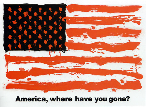
 Adrienne Burk - Death Flag
USA, 2003
The visual field is painted gesturally as lines of text, though not technically calligraphic.
In this bold and simple Image, the designer creates an American flag out of blood and oil, suggesting America has forgotten constitutional ideals. The poster was used at anti-Iraq was protests.
-
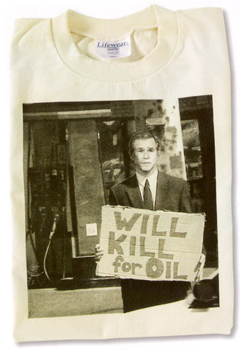
 Christopher Loch - Will Kill for Oil
USA, 2004
Handwritten built-up letters create the effect of a street poster.
A satirical design based on the phrase "Will work for food" has been used for T-shirts, postcard, and stickers. The posture of a begging Bush reminds everyone that the continuing cooperation of Americans is needed to sustain his policies.
-
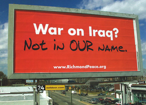
 Noah Scalin - War on Iraq?
USA, 2003
Handwritten marker-style as a response in graffiti to "established" type.
"Not in our name" became a phrase used by the peace movement before the war in Iraq was initiated. The campaign was originally planned as a series of billboards with a variety of messages but reverted to a single location after the original billboard company refused to run the series due to its content.
-
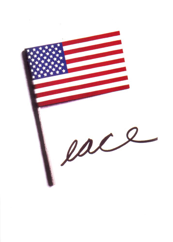
 Stanley Eisenman - Peace
USA, 1970
Handwritten marker style letterforms have a straightforward intent.
In this poster, the American flag represents the p in the word "peace" and conveys in a simple and powerful way that the United States should get out of Vietnam.
-
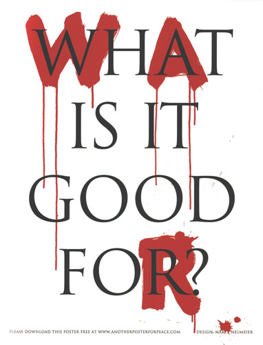
 Marty Neumeier - War - What is it Good For?
USA, 2004
Large brush letterforms in paint are overlaid with type for dramatic contrast.
Contrasting a raw, emotional typeface with a measured, thoughtful one, this artist captures the conflict between passion and reason, war and peace. The message is from the first line of a song popular in the early 1970s.
-
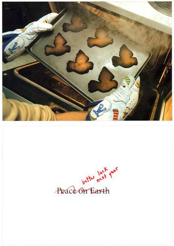
 Lisa Gibson - Burnt
USA, 2003
Naïve, informal handwritten miniscules in festive red holiday pen carry out the homespun feeling.
During a season of warm wishes and good cheer, it is especially poignant to receive a holiday card focused on how peace, the most vital thread keeping our world united and healthy, has been burned and broken.
-
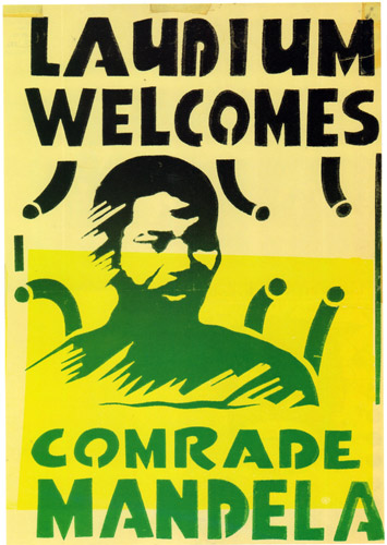
 Unknown Artist - Laudium Welcomes Comrade Mandela
South Africa, 1990
Effective letterforms in the hand-cut stencil style.
This poster welcoming Nelson Mandela for his visit to the township Laudium was produced in the "old South Africa" and was therefore illegal under the terms of the "state of emergency." Posters of this nature are now virtually impossible to come by.
-
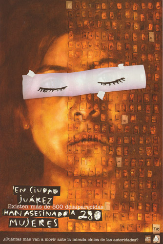
 Margarita Sada - More than 280 Women Have Been Murdered
Mexico, 2002
Scratchboard script conveys the artist's awareness of violence behind this message.
The designer notes, "For more than ten years, hundreds of women in the Mexican town of Juarez have been kidnapped, raped, murdered, and grotesquely maimed. After years of official apathy and police incompetence toward solving and ending these brutal murders, the families of the missing women started actions to demand justice. I made this poster to support their struggle." The text reads "More than 280 women have been murdered in Juarez City and another 500 more are going to die under the cynical stare of authorities?"
-
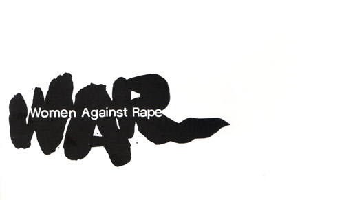
 Carole Goodson - Women Against Rape
USA, 1972
Large brushwork provides a knockout background for the message.
This clever acronym for a grassroots women's group, which mobilized in response to an increase in violence against women, is immediate and powerful.
-
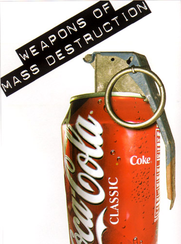
 Chaz Maviyane-Davies - Weapons of Mass DestructionUSA, 2004
The handlettering of the logo is contrasted to the Dymo labeling; though not technically a calligraphic usage, the letterforms are interesting in terms of graphic language used to put forth a dissenting opinion.
Text: The designer ponders, "What are the products of globalization - the silent war?" Often the most pervasive and damaging can seem to be the most innocuous. This postcard is from a series of for entitled "The Language of War."
-
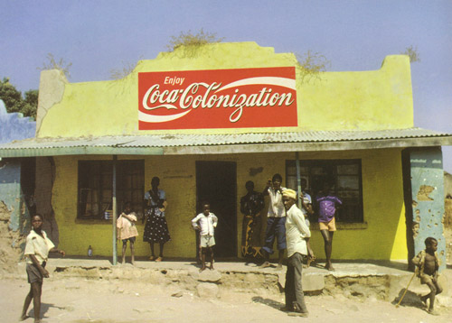
 Chaz Maviyane-Davies - Coca-Colonization
USA, 2000
Handlettered continuation of the logo provides the theme for this anti-exploitation ad.
This work illuminating corporate global branding in third-world countries was run in Adbusters magazine.
-
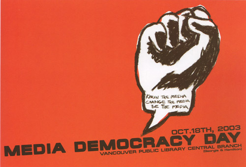
 Valerie Thai - Media
Canada, 2002-2003
Handwritten pencil lettering is used to combine with the hand-drawn fist image; typography would not have worked as well.
The image of a clenched fist as a speech balloon was created for Canada's Media Democracy Day created to protest the dominant mass media system and promote independent media and citizens fighting for their right to news and information, and their basic right to communicate their opinions.
-
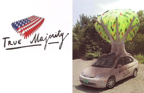
 Stefan Sagmeister, Matthias Ernstberger - True Majority
USA, 2002
Uneven, every day handwriting is used to represent the views of the average American.
This logo was designed for a grassroots education and advocacy group led by Ben Cohen (co-founder of Ben & Jerry's) and compromised of 200 business leaders, CEOs, and military advisers. The group's goals are to adopt long-term policies designed to prevent another 9/11 by dealing with world hunger, reducing dependence on oil, and paying our UN dues.
-
 Paula Scher - All the News that Fits
USA, 2001-2003
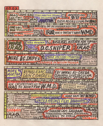
Handwritten capitals in many colored pencils mimic the attitude of the news.
This visual essay, which appeared in Print magazine, records in a personal and powerful way, the texture of the news before and after 9/11. The author, Paula Scher, observes "The news abruptly switched from a background of sex to a background of terror, without missing a beat." The image shown is only a small portion of the work.
-
 Ward Sutton - Republican Rage
USA, 2001
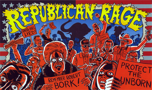
Handwritten letters appropriately form portray posters art elements and the drawn flaming letters portray mob anger with a contemporary graphic novel approach.
Elephants never forgot and neither do republicans, according to the results of the 2000 election. The artist believes right-wing anger and mob-rules mentality forced Democratic presidential candidate, Al Gore, into the position of loser.
-
 Mateja D. Zavri and Robert Krzmancic - Ceci n'est pas un terroriste
Slovenia, 2002
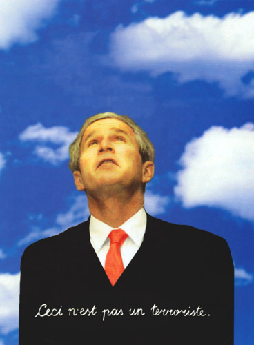
Cursive handwritten letterforms mimic the words in René Magritte's surrealist painting.
This ad, created for the Slovenian political weekly Mladina magazine, presumes that the magazine's readership is familiar with Magritte's painting, Ceci n'est pas une pipe, in which the artist asks his audience to question what we accept as reality by presenting a painting of a pipe and titling it "This is not a pipe." In this case, the title reads "This is not a terrorist."
-
 Nicholas Blechman - Ceci n'est pas une comic
USA, 2003
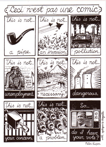
Cursive handrwitten scrawl recalls the historical usage of surrealist artist René Magritte.
The comic created for the Empire issue of NOZONE magazine plays with the notion of reality compared to what the Bush administration espouses. The comic borrows images from Magritte's Ceci n'est pas une pipe painting, a surreal icon.